Contents
- 1 Why Not Being Mobile-Responsive Costs You Sales Every Day
- 2 The Numbers Don't Lie
- 3 What "Responsive Design" Actually Means
- 4 The Business Impact (Real Numbers)
- 5 The Cost of Not Being Mobile-Responsive
- 6 But It's Not Just About Sales
- 7 The "We Have an App" Excuse
- 8 The "Our Customers Use Computers" Excuse
- 9 What Actually Changes When You Go Responsive
- 10 The Technology Has Caught Up
- 11 The SEO Advantage Nobody Talks About
- 12 The Implementation Reality
- 13 What Your Competitors Are Doing
- 14 The 2026 Reality
- 15 What Happens When You Fix This
- 16 Making the Decision
- 17 Getting Started
- 18 The Bottom Line
Why Not Being Mobile-Responsive Costs You Sales Every Day
The Problem You Can't See
Right now, someone is trying to visit your website on their phone. Maybe they're potential customers. Maybe they're trying to find your contact information. Maybe they're checking if you're a serious company before signing a contract.
Here's what happens:
Your website doesn't fit their screen. Text is tiny. They have to pinch and zoom. Buttons are too small to tap. The menu doesn't work. Images overlap text. Nothing loads properly.
They leave in 7 seconds.
You just lost a customer. And you never knew they existed.
This happens dozens of times every single day.
The Numbers Don't Lie
Let's look at what's actually happening in 2026:
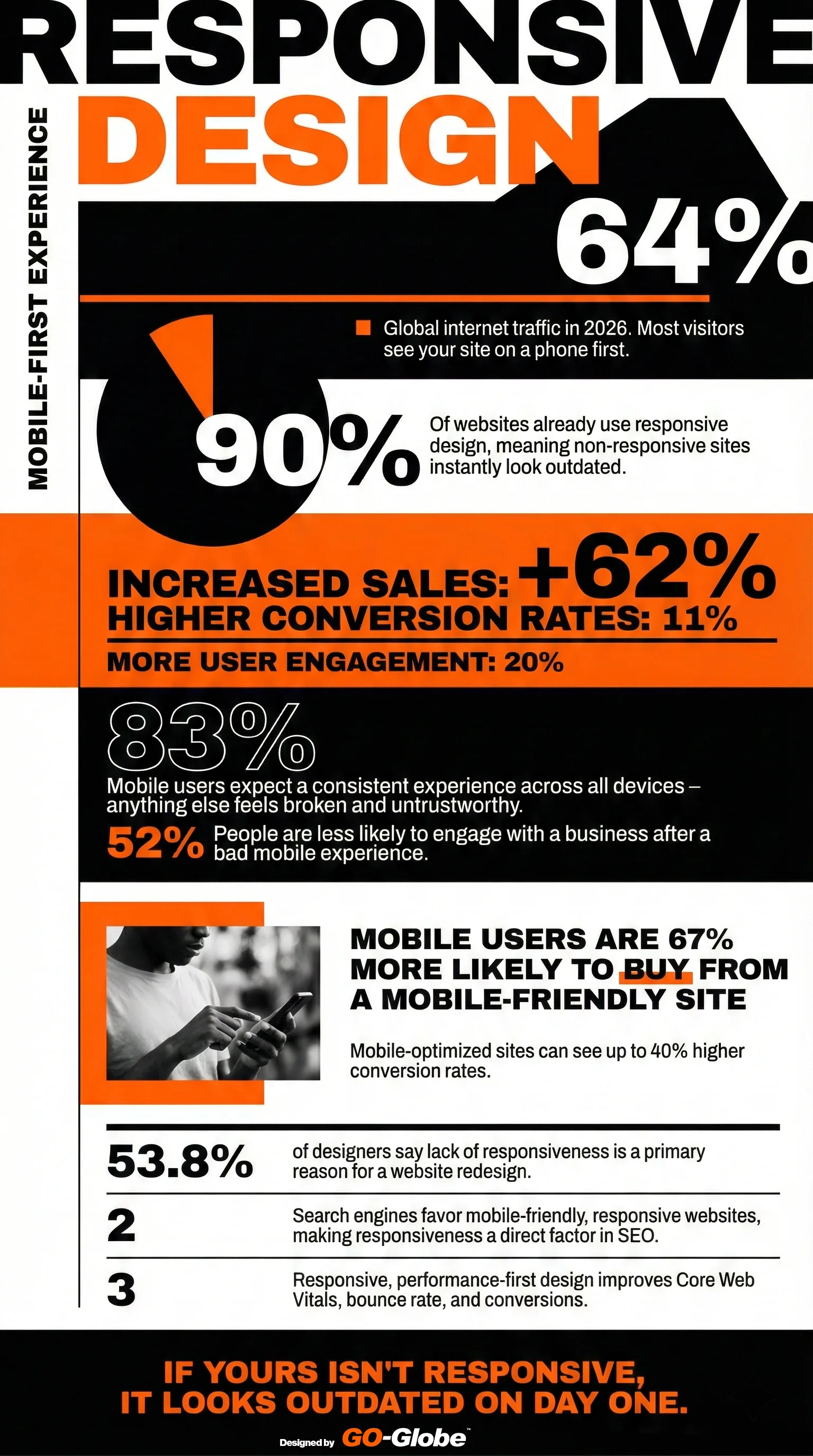
62-64% of all internet traffic is mobile. That means most people see your website on a phone first, not a computer. If your site doesn't work on mobile, you're failing the majority of your visitors before they even read a single word.
90% of websites are already responsive. Your competitors figured this out. If your site isn't responsive, you instantly look outdated compared to everyone else. It's like showing up to a business meeting in clothes from 20 years ago.
52% of people won't engage with your business after a bad mobile experience. Not "might not." Won't. One bad visit and they're gone forever. They'll go to your competitor whose website actually works.
What "Responsive Design" Actually Means
Forget the technical jargon. Here's what responsive design means in plain language:
Your website automatically adjusts to fit any screen - phone, tablet, laptop, desktop. The layout changes. Text resizes. Buttons move. Everything reorganizes itself so it's easy to use no matter what device someone is using.
One website that works everywhere. You don't need a separate mobile site. You don't need an app. One website that simply works properly on every device.
That's it. That's responsive design.
The Business Impact (Real Numbers)
Companies that implement responsive design see:
11% higher conversion rates. More visitors become customers. Same traffic, more sales.
20% more user engagement. People stay longer. They read more. They click more. They take action.
62% of businesses report increased sales after making their site mobile-responsive. Not "better brand perception" or "improved user experience." Actual increased sales. Money in the bank.
67% of mobile users are more likely to buy from a mobile-friendly site. Your competitors with responsive sites are literally stealing your customers because their sites work and yours doesn't.
Up to 40% higher conversion rates on mobile-optimized sites. That's not a small improvement. That's game-changing.
The Cost of Not Being Mobile-Responsive
Let's do some real math:
Scenario: Small business website
- Monthly visitors: 5,000
- 64% on mobile: 3,200 mobile visitors
- Without responsive design: 52% leave immediately = 1,664 lost visitors
- Average conversion rate: 2%
- Lost conversions per month: 33 potential customers
- Average sale value: $500
- Monthly lost revenue: $16,500
- Yearly lost revenue: $198,000
That's nearly $200,000 per year you're throwing away because your website doesn't work on phones.
Scenario: Medium business website
- Monthly visitors: 20,000
- 64% on mobile: 12,800 mobile visitors
- 52% leave immediately: 6,656 lost visitors
- 2% conversion rate: 133 lost conversions
- Average sale value: $1,000
- Monthly lost revenue: $133,000
- Yearly lost revenue: $1,596,000
Over 1.5 million dollars. Gone. Because your website doesn't fit on a phone screen.
But It's Not Just About Sales
Here's what else you're losing:
Search engine rankings. Google and other search engines favor mobile-friendly websites. If your site isn't responsive, you rank lower. Fewer people find you. Even fewer visitors to convert.
Professional credibility. When someone visits your non-responsive site on their phone, they assume you're either outdated, don't care about customers, or can't afford proper technology. None of these are good for business.
Employee productivity. Your own employees try to access your company website on their phones. If it doesn't work, they're frustrated. If you have an intranet or client portal that isn't responsive, your team wastes time every single day.
83% of mobile users expect a consistent experience across all devices. When they don't get it, they assume something is broken. They don't trust you. Trust is everything in business.
The "We Have an App" Excuse
Some companies say: We don't need a responsive website because we have an app.
Wrong.
People won't download your app before they trust you. They visit your website first to decide if you're worth their time. If your website doesn't work, they never download the app.
Apps require updates and maintenance. A responsive website works everywhere without anyone downloading anything.
Not everyone wants your app. Even your best customers might just want to quickly check something on your website. If it doesn't work, they get frustrated.
The "Our Customers Use Computers" Excuse
Some businesses, especially B2B companies, say: "Our customers are professionals who use computers, not phones."
Also wrong.
Even B2B decision-makers use phones. They check your website during their commute. At lunch. While waiting for a meeting. After work hours. Just because they work on computers doesn't mean they only browse on computers.
53.8% of designers say lack of responsiveness is the primary reason websites need redesigns. Even if your customers were only using computers (they're not), your website will need a redesign soon anyway. Why not do it right now and stop losing money?
What Actually Changes When You Go Responsive
Let's be specific about what happens:
Before responsive design:
- Customer visits on phone
- Site doesn't fit screen
- Customer leaves in 7 seconds
- You lose sale
- Customer tells others your site is bad
- Your competitors gain customers
After responsive design:
- Customer visits on phone
- Site fits perfectly
- Customer can read everything
- Buttons work properly
- Customer stays, browses, takes action
- You get the sale
- Customer recommends you to others
It's that simple.
The Technology Has Caught Up
Five years ago, making a website responsive was difficult and expensive. Some features didn't work on mobile. Performance was slow. It was complicated.
Not anymore.
Modern responsive design works perfectly. Sites load fast on mobile. Everything functions properly. Forms work. Videos play. Images look great. Navigation is smooth.
The technology is mature and proven. There's no excuse anymore.
The SEO Advantage Nobody Talks About
Search engines don't just "prefer" mobile-friendly sites. They actively punish sites that aren't mobile-responsive.
Your non-responsive site ranks lower in search results. Fewer people find you organically. You have to spend more on ads to get the same traffic.
Responsive design improves Core Web Vitals - the technical metrics Google uses to rank sites. Better performance. Better user experience. Better rankings. More organic traffic.
Mobile-first indexing is the standard. Google looks at your mobile site first when deciding how to rank you. If your mobile site is broken (or non-existent), your rankings suffer across all devices.
This isn't coming in the future. This is happening right now.
The Implementation Reality
"How long does it take to make our site responsive?"
For a new website: It's built responsive from the start. No extra time needed.
For an existing website: Depends on complexity, but typically 4-8 weeks for a complete responsive redesign.
"How much does it cost?"
Less than you're losing every month by not being responsive. Remember that small business losing $16,500 per month? A responsive redesign might cost $10,000-30,000. It pays for itself in 2-3 months.
"Can we just make our current site work on mobile without redesigning everything?"
Sometimes, but usually the better approach is a proper responsive redesign. Your site probably needs updates anyway. Do it right once rather than patching problems forever.
What Your Competitors Are Doing
90% of websites are already responsive. Your competitors finished this years ago. While you're debating whether responsive design matters, they're taking your customers.
Every day you wait:
- They look more professional
- They get better search rankings
- They convert more mobile visitors
- They grow faster
- You fall further behind
The 2026 Reality
We're not talking about the future anymore. This is the present:
Mobile is the default. Most people's first (and sometimes only) experience with your website is on a phone.
Non-responsive sites look broken. Not just old-fashioned. Actually broken. Like you don't know what you're doing.
User expectations are absolute. People expect every website to work perfectly on mobile. When yours doesn't, they don't make excuses for you. They just leave.
The gap keeps growing. As more companies optimize for mobile, the difference between responsive and non-responsive sites becomes more obvious. You can't hide in the crowd anymore.
What Happens When You Fix This
Companies that implement responsive design report:
Immediate improvements:
- Mobile bounce rate drops by 30-50%
- Time on site increases
- Pages per session goes up
- Contact form submissions increase
- Phone calls from mobile visitors jump
Within 3 months:
- Search rankings improve
- Organic traffic increases 20-40%
- Sales conversions from mobile rise 40%+
- Customer complaints about website drop to near zero
Within 6 months:
- ROI becomes obvious
- Mobile sales become a significant revenue stream
- Marketing effectiveness improves (same ad spend, better results)
- Professional reputation strengthens
Making the Decision
You have two choices:
Option 1: Keep your non-responsive site. Continue losing 52% of mobile visitors immediately. Watch competitors take your customers. Lose $16,500+ per month (probably much more). Fall further behind in search rankings. Look increasingly outdated.
Option 2: Implement responsive design. Capture those mobile visitors. Convert them into customers. Improve search rankings. Look professional and modern. Stop the bleeding and start growing.
The math is simple. The decision should be too.
Getting Started
You don't need to become a design expert. You just need to decide this matters and make it happen.
Find a developer or agency that specializes in responsive design. Show them your current site. Ask for a mobile-first responsive redesign. Get a timeline and budget. Make it happen.
The cost of doing it is less than the cost of waiting another month.
The Bottom Line
62-64% of your visitors use mobile devices.
52% of them leave immediately if your site doesn't work properly.
You're losing thousands of dollars every single month.
This isn't about following trends or having the latest technology. This is about not throwing away half your potential customers before they even see what you offer.
Your competitors figured this out. Your customers expect it. The search engines demand it.
The only question is: how much more money will you lose before you fix it?
Need Help Making Your Website Mobile-Responsive?
GO-Globe builds responsive, mobile-first websites for businesses and governments across the GCC region. We've been doing this since responsive design became critical, and we've helped hundreds of companies stop losing mobile customers.
Whether you need a complete redesign or want to make your current site responsive, we'll give you a straight answer about what's needed and how much it costs.
Let's talk about stopping the money you're losing every day.