A successful logo can’t be just creative or clever. Because a logo ends up being an important guest at many occasions, it absolutely must perform and behave well no matter what. In this sample chapter, you’ll learn what makes a good logo and how to design one that’s right your business.
The most successful business logos share valuable characteristics. Here are some of the most important.
A successful logo can’t be just creative or clever. Because a logo ends up being an important guest at many occasions, it absolutely must perform and behave well no matter what.
It is a tricky balancing act, but one that you can achieve. All you have to do is consider what makes a logo effective. Make sure your design follows these guidelines.
1. It Is Simple
The “too busy” logo is a roadblock to communication, so don’t crowd it with stuff: green, flag, fairway, golfer, peninsula, borders, circles, curving type. It’s easy to get carried away, but you’ll create a stronger image with fewer pieces.
2. It Is Bold
Fine lines make lovely illustrations but poor logos because 1) they’re difficult to see, and 2) a fine line will often break up or even disappear when reproduced.
3. It Works Well in All Sizes
This one is often overlooked by designers who make presentations on large format paper: The logo that looks great at billboard size must also work on a business card.
4. It Is Appropriate for the Business
This seems like common sense, but in the throes of artistic rapture, common sense often goes out the window. Make sure the whimsical crop-duster that was so much fun to draw is suitable for the client, in this case, a regional commuter airline.
5. It Is Distinctive
Don’t settle for the ordinary (let other companies be ordinary). Your company is unique—that is, it has a distinctive culture and market presence; capture this intelligently and thoughtfully.
Circles Are Strong Design Elements
A circle is a familiar focal point which the eye can interpret with little effort. Its soft edges are more often pleasing than those of angular squares and triangles. Cousin to the circle is the ellipse.
Avoid Trendy Typefaces
Unless you’re in the fashion business, the type you choose for your corporate identity should still be suitable years from now. Laser printer standards—Times, Palatino, Helvetica—are always appropriate; in general, low-key is best.
Avoid Extremely Tall or Wide Logos
Odd shapes are hard to fit into common spaces—business cards, advertisements, and so forth—and as a rule they aren’t as pleasing, either. A good proportion for a logo is roughly 3 units by 2 units tall, about the ratio of a TV screen (a 1-to-1 ratio also works quite well).
Design Logo and Name as a Unit
If the company name will be part of the design—especially popular on signage—look for ways to integrate the two.
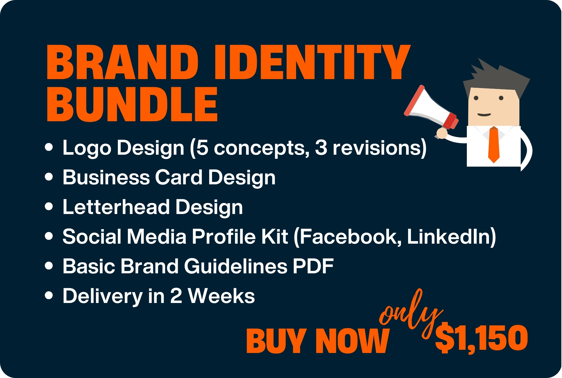
Contact Now to get your Professional Logo Design in Ajman
This entry was posted on Friday, February 27th, 2009 at 11:46 am and is filed under Corporate identity, Home. You can follow any responses to this entry through the RSS 2.0 feed.