


About GO-Globe
Top quality, technology innovation, modern systems since 2005
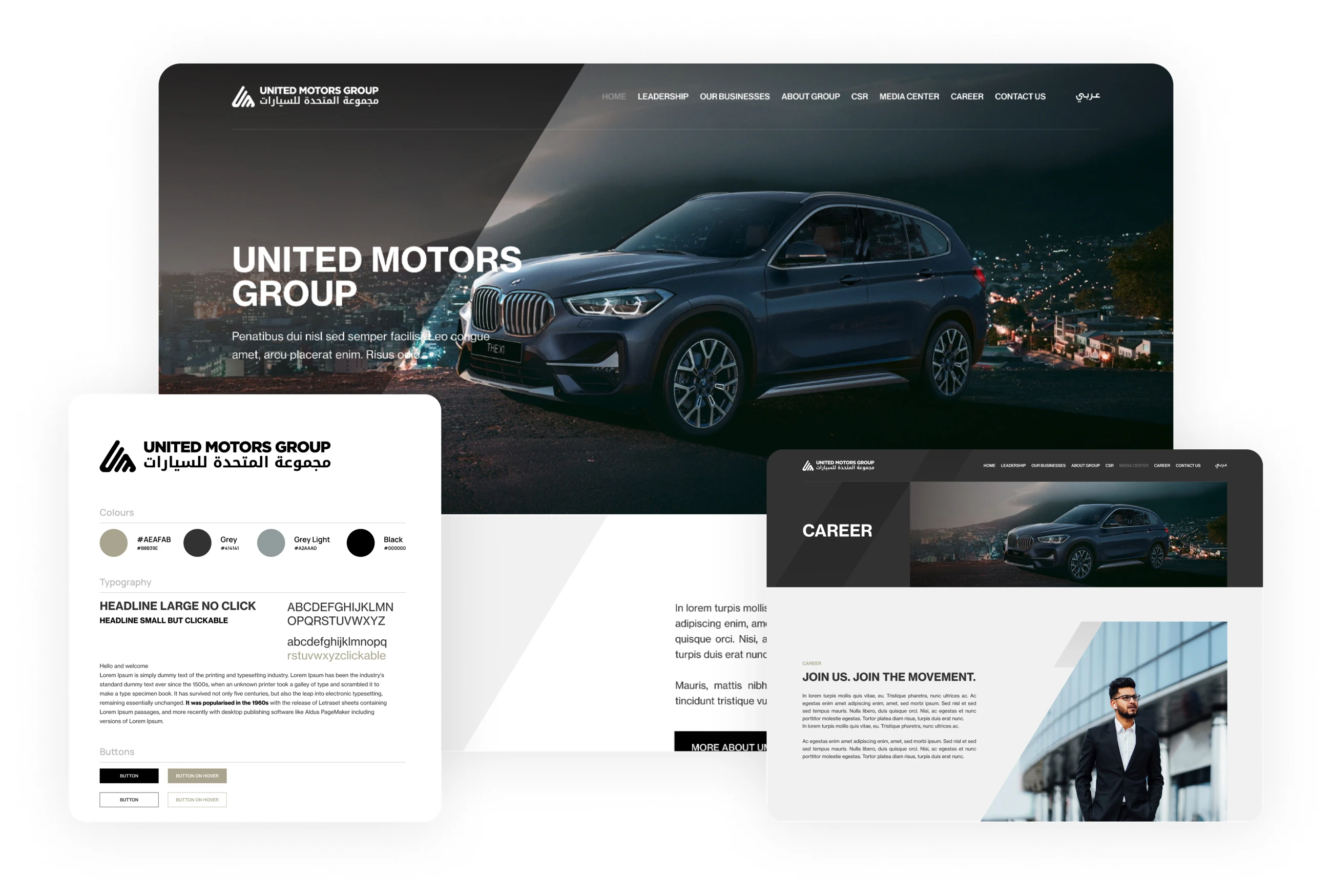
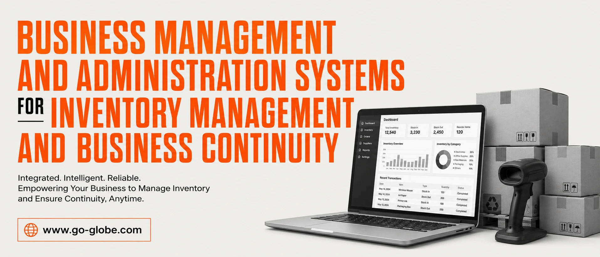
GO-Globe leads in Corporate Web Apps, Custom Development, E-Commerce, ERP, AI Innovations, Branding, Hosting, and Business Advice.
Our expertise covers custom web design & development, mobile apps, e-commerce, VR/AR, AI ChatBots, and top consultancy. We serve various industries globally.
Founded in 2005 in Dubai, our clients include businesses, governments, royal families and charities. They all benefit from our profit-focused approach and fair policies.
Boost your profits with GO-Globe – your partner in innovation and growth!