Navigation is perhaps the most important element on a web page as it allows users to browse to other pages of a website. Providing a navigation on a website is like providing a map to a traveler so they can navigate their way to the destination. Providing an easier UX and complete navigation makes it easier for users to browse a website and find what they are searching. This in turn also improves important KPI metrics, like conversions, bounce rate and pages viewed per session.
Let’s say you have an ecommerce store. A user comes to your homepage looking for shoes, but it has all sorts of apparel items. The user will try to find the page that only shows shoes you are selling. Now think about it. If the navigation bar is hidden or does not have any link to the shoes page, what will happen? Instead of spending time on searching that page, he will most likely exit your website and your competitor’s store.
Considering its importance, it makes sense to focus on designing a navigation menu that will enhance the UX of a website. How you can achieve that? Here are some tip you may follow.
Contents
First Structure, Then Design
Cluttering a design with too much information can be overwhelming for users. Same goes for navigation menu. As a website designer, you must decide how to arrange links in a menu, how many labels to include and how much space should be between each label. For this, there are two pre-requisites.
First, you must have a well organized website architecture. You must know the number of parent pages as well as how many child pages are there for each parent page. Second requirement is that you must know which parent pages are the most important.
NN Group website has mapped out their website navigation structure in a way that clearly illustrates what are their main pages. This will help web design company decide which pages should go in the main navigation bar. The designer can decide the style of navigation, whether there needs to be a dropdown, or how much space the navigation will take.
Sticky All The Way
If you use Facebook or Twitter, you must have noticed that their top navigation bar is fixed to the top of web page no matter how much you have scrolled down. This is called sticky navigation and it is quite convenient on a website where user needs long scrolling or on a single page website.
Let’s say you are checking your Twitter feed and you have been scrolling down for few seconds. Now, you want to check your Notifications. What would be more convenient? Scrolling all the way to the top, just to click on a button? Or being able to use the navigation menu from right where you are? Obviously, it is the latter one.
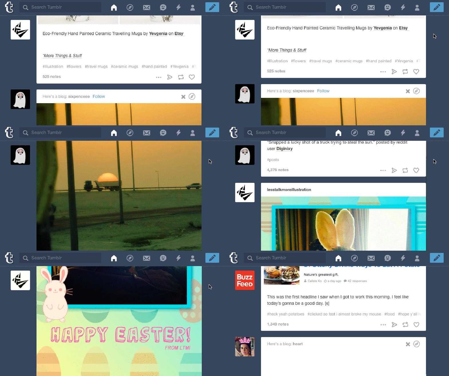
According to a research conducted by Hyrum Denney, it was found that website with sticker menu is 22% quicker to navigate. Among 40 participants, 34 found the website with sticky navigation easier to use.
Alternatively, you can also provide a “Return to the Top” button on the bottom of the page, so user can jump to the first fold instantly. However, it is still a best practice and industry standard to use stick navigation where long scrolling is required.
Where Am I?
Large websites with too many category often presents a challenge to users. When a user lands on a sub-category or product page, it is possible that they might want to view the higher level category page as well. To make it easier for users to navigate freely between sub-categories, you can user Breadcrumbs to have friendly UX website .
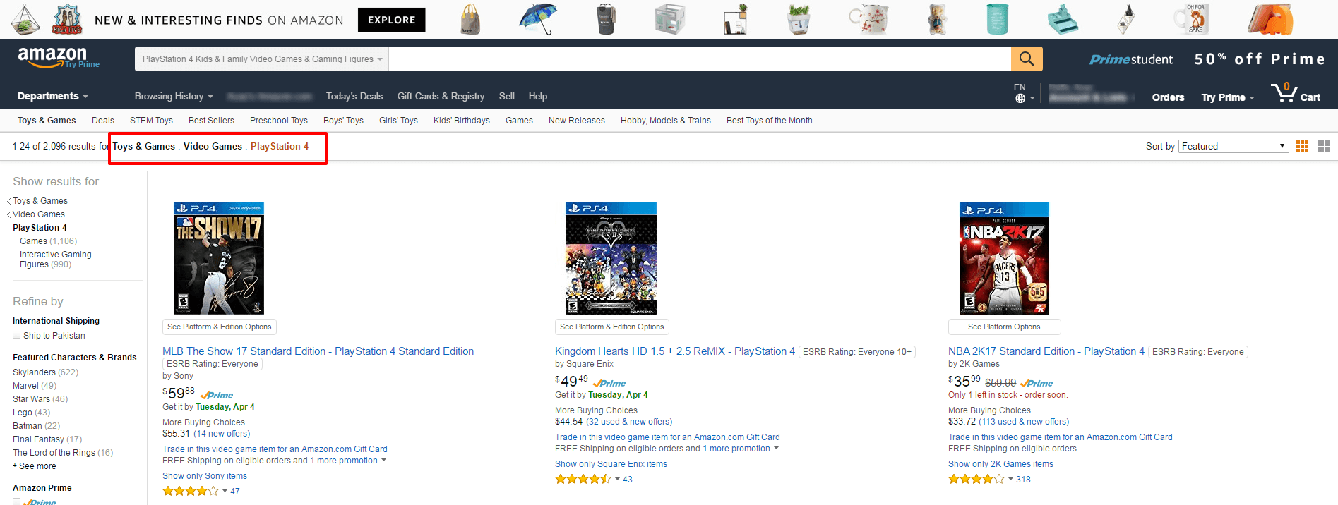
Have you bought something from Amazon before? At least you must have visited their store for something. Have you noticed 3 or 4 links in the space just below navigation bar (highlighted in the image above)? This is called Breadcrumbs. Amazon uses this along with visual cue, noticed that the current page (PlayStation 4) is highlighted with a color, to show users their current location.
So, if you are providing Breadcrumbs, for example, it will be easier for user to simple click on the first level category, Toys & Games, rather than hitting back key multiple times. It prevents confusion, saves time and provides convenience. All in one for user friendly UX.
This also helps in improving conversion. For example, a PS4 owner lands on NBA2K17 product page and added to the cart. Now he wants to browse and buy more PS4 games. If the breadcrumb links are available, he can quickly go to the previous level category directly from NBA2K17 page instead of search PS4 games on the search box.
Don’t Limit it to Desktop Only
There was a time when we could only browse internet using a desktop PC, then came laptop and now we have mobiles, tablets and even TVs for that. This presented a new challenge for web designers, i.e. designing for multiple screens. The solution was responsive web design.
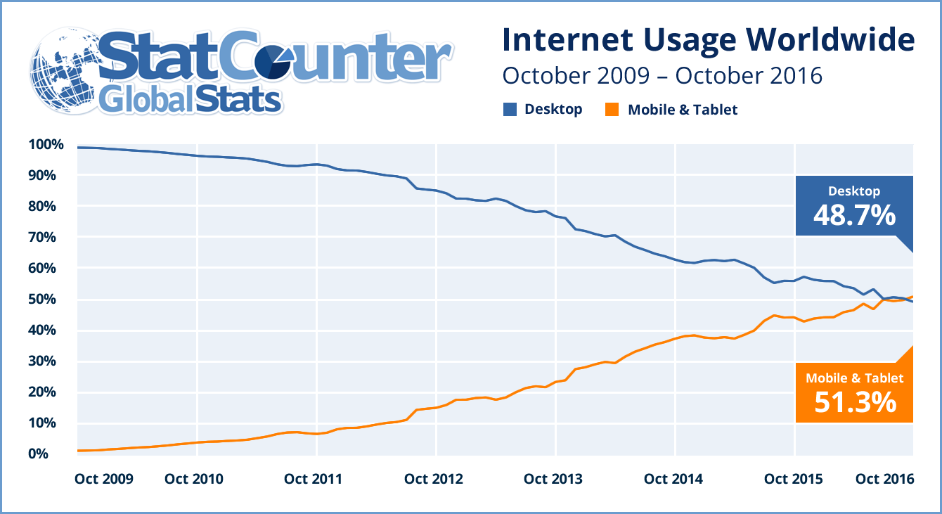
According to StatCounter, 51.3% of all web visits from around the world were from mobile in 2016. Considering the number of people using Internet on mobile, it is necessary to ensure that your website, including navigation, is mobile friendly.
On mobile, we have limited space. It would be annoying for user if most of the first fold space is covered with navigation. The solution is to keep main navigation to the bare essential and use slide out as a secondary navigation menu.

Notice how Apple.com only has hamburger icon, logo and bag icon on the top navigation. For full navigation, user can click on the hamburger icon to reveal it. This saves space and keep the top navigation simple, so you can show your most important content on the first fold.
Conclusion
Website navigation doesn’t usually take much space on a page, but it is still a major part of it. Without navigation it would be difficult for a user to find the desired information quickly. A user friendly navigation is one that makes it easier for users to find the page they are looking for in 3 or less clicks. The more easier it is to navigate, the more likely user is going to convert.
In an experiment on optimizing conversion, two versions of a navigation menu were tested. The original menu required users to click on the few pages to go to the inner page. The variant menu had a dropdown that allowed users to directly go to the inner page from anywhere on the website. The variant menu resulted in gaining 21.34% higher goal completion.
This is why, making it easier for users to navigate through your website is important for improving key metrics, like conversion and bounce rate.
1. What role does website navigation play in UX?
Website navigation holds paramount importance in User Experience (UX), as it dictates how effortlessly users can locate the content they seek. Superior navigation enhances usability, heightens user satisfaction, augments site interaction, and drives higher conversion rates.
2. How can I simplify my website navigation without compromising functionality?
To strike a balance between simplicity and functionality, concentrate on core categories and their relevant subcategories. Employ dropdown or mega menus for expansive content, ensuring they are meticulously structured and intuitive to navigate.
3. What is the optimal method to prioritize content in navigation?
Content prioritization should align with both user expectations and business objectives. Elevate critical pages or sections—such as products, services, or contact details—by placing them in strategic positions within the navigation bar. Utilize analytics and user insights to continually refine this prioritization.
4. Why is consistency vital in website navigation?
Consistency in navigation instills confidence in users by enabling them to learn and predict site movement patterns. Uniform navigation elements across pages facilitate seamless browsing, eliminating the need for users to relearn the layout, thereby providing a more cohesive experience.
5. How do descriptive labels enhance navigation?
Descriptive labels succinctly convey the purpose of each link or menu item, simplifying the user's journey through the site. This clarity diminishes the chances of users feeling disoriented or frustrated, thereby enhancing the overall UX.
6. Is it advisable to incorporate icons in my navigation?
Indeed, icons can be integrated into navigation but should serve as a complement to text labels rather than a replacement. Icons can amplify visual appeal and aid in rapid recognition, but accompanying text ensures clarity, especially for users unfamiliar with iconography.
7. How can I assess the efficacy of my website navigation?
Evaluating your website navigation involves conducting user testing where real users attempt to locate specific information. Furthermore, analyze site analytics to identify points where users disengage or encounter difficulties. Leverage these insights to fine-tune and improve your navigation architecture.
8. Should a search bar be included in my navigation?
Incorporating a search bar is strongly recommended, particularly for content-rich websites. A search bar offers an alternative pathway for users to swiftly locate desired content, significantly enhancing the site's overall usability.
9. How frequently should I review and update my website navigation?
Regular reviews of your website navigation should be informed by user feedback, analytics data, and shifts in content or business strategy. At a minimum, conduct a comprehensive review annually, though adjustments should be made as necessary to sustain an optimal user experience.


