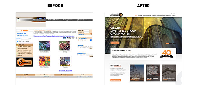
In a nutshell, it’s safe to finally admit our lives practically depend on our digital infrastructure. For that reason, it is essential to provide users with a refined web design that depicts your business for what it truly stands for. While there are two sides to every penny, the sad truth is that where your website might look close to perfection in your eyes; there could be a few spots you missed when searching for errors. Your digital efforts are literally what can either make or break your reputation.
With thorough planning, you can reduce the chances for embarrassment massively. This can change the whole vibe of your site and switch it into your very own golden goose. If you are ready to take on the change and wish to understand what’s causing your potential customers to leave your site - here are some of the reasons and what you can do about them below.

Contents
- 1 But First, What is the Importance of a Good Web Design
- 2 Web Design Fails: A Website that Takes Forever to Load
- 3 Web Design Fails: Overly Stuffed Pages
- 4 Web Design Fails: Call to Actions Gone Wrong
- 5 A Responsive Design Will Always Be the Winner!
- 6 Which of these Sinful Web Design Fails have you Come Across?
But First, What is the Importance of a Good Web Design
First Impressions May Matter More than You Know
It’s important to understand that just like any other case, the first impression truly is the last impression. If a user visits your site and faces any sort of difficulty or inconvenience, that is the first and foremost reason your site may experience a high bounce rate.
Any visitor is bound to take less than five seconds to decide whether or not they are comfortable to stay any longer on your website. To avoid losing traffic it’s essential to work on refining your first impression. Make sure everything is clear and visible, and it radiates positivity fluently. They need to know where everything is and what they can do.
Should you fail at this, it’s close to impossible that the lost traffic will return any time soon.
Quality = Trust
One line is usually all it takes for your visitors to form their first impression. Only you can establish a bond of trust with the help of your content. If the reader feels like they can connect to it and trust your information before even reading all of it, then you have won them over.
Each factor plays a role in the final look. Here are some common mistakes in web designs you need to avoid.
Web Design Fails: A Website that Takes Forever to Load
Time is money. And no one has the time of day to wait for a page to load.
Of course, having some pretty animations and the latest technology embedded in your site is all sorts of fun and people may love to see it too - but if it takes them a century just to see it, there’s a high probability they won’t stay long enough to.
Instead, most importantly what you can do about this is to take performance along with the design. There are a few websites available that allow you to test the loading speed of your website. With the help of these sites you can track down what is causing the delay for you to find alternatives to decrease the time.
Web Design Fails: Overly Stuffed Pages
If you’ve heard the saying “Less is more” and have wanted to see a physical representation of it - then web design is the best place to start. The ultimate rule to the best design for your website is to stick with the idea of keeping things on a low. A minimalistic vibe run throughout the site is bound to make users want to stay longer as they get a fresh and clean look from which they can easily find what they need to carry out the tasks they came for.
This rule applies all over the site. Be it, in a popup, video, advertisement, everything! The lesser things you have included, the more representable the overall look of your website will be.
For this you can focus on:
- Choosing a rather simple design to let the focus be on the content rather than a noisy design.
- Remain consistent with your style, as this plays an essential role in branding.
- Let your design breathe by leaving out some blank spaces. This allows the user to feel at ease while going through your website.
- Create a division between your content wherever necessary so that users can find what they need without any hassle.
Web Design Fails: Call to Actions Gone Wrong
Every website has a goal, a purpose, or something that calls the visitor towards them. This is the true essence of what a call to action stands for. A common mistake made whilst designing a website is not carefully thinking through the placement of them.
Most of the time, they are either pushed so far down they’re impossible to find, or they’re too average to get the attention they require. Even worse, sometimes there are multiple call to action buttons scattered around on one page that the user is left in confusion as to what they should do.
With web design fails list a website needs to feel easy on the eyes and mind at all times for the users to feel at ease in deciphering what the objective is of your site and how they can benefit from it. For this, you need to make sure they are displayed prominently, make it easy for them to agree to it, and be very careful about how and where you use popups on your site!
A Responsive Design Will Always Be the Winner!
We live in an advanced age of technology and each and every one of us is dependent on our trustee smartphones to get us through the day. It’s not a secret to any of this at this point, and even then according to recent researches 28% of newly constructed WordPress websites have not chosen a mobile responsive theme! Wait, what!?
Without incorporating this feature to your design, you are only alienating a large number of potential visitors just because they don’t use a desktop/laptop to surf the internet! That too, by putting yourself at risk of being penalized by Google! That’s a lot just for not incorporating mobile responsiveness.
What you can do for this is; make your design compatible across all devices. The internet is full of plugins and themes that allow you to do so. And if you want to go rogue and do it all yourself, you can even try following some instructions online as to how to make your existing theme responsive.
Which of these Sinful Web Design Fails have you Come Across?
If you want your website to be successful, you need to look harder into refining your web design to the mass. If you have a good web design fails list, with it you can establish trust, create a bond that allows you to guide them, and increases the usability of your website on a whole.
It may be difficult to master, but if you manage to maintain a sweet balance between aesthetics and functionality - in this case even a little goes a long way!